Thursday, December 19, 2013

What to do with a View: Sketches, Photos and Ideas

One reason I rent a studio space rather than painting in my kitchen, quite apart from the health and hygiene considerations, is to force myself to show up and paint. At home there are always distractions and excuses, whereas if I pay rent each month I have to justify the expense and use the place. Now I'm feeling much the same way about the panoramic views from my apartment: while I certainly enjoy just looking at them, it's not quite enough. If I call myself an artist I should be able to use the raw material outside.

My former home had "peekaboo views" between the houses. In 2011 I set myself the task of taking a photograph every morning through the same gap, where on clear days Mt. Baker's volcanic peak poked up.The sunrise pictures, such as this one from late January, were the most dramatic . . . but more often than not the mountain's face was veiled, so I called the series "Mt. Baker or Not." I kept it up for a whole year, except when I was away from home.
 
Last winter I moved to an eighth floor apartment with unobstructed views not just of Mt. Baker, the highest and most distant peak, but, working from east to west, the Golden Ears,  Seymour, Grouse, the Lions, and Hollyburn, along with many others that I can't name. And on days when I the weather obscures them all, six immense cranes dominate the scene.

Looking directly north I see the eastern side of Grouse, with its ski slopes at present waiting for more snow. I can just about distinguish the line of chair lift supports--easier at night, when they are lit up. Moving down, I see forested hillsides and the buildings of North Vancouver. Then in the middle distance the view gets really complicated, with docks on both sides of the inlet. Massive structures and loading machinery overlap each other and present weird perspectives. It's hard to tell what's on land and what's on the water. Activity continues day and night, and things change shape and position. Freighters, tugs and barges come and go, stacks of containers form and re-form, and the orange cranes regroup themselves and raise and lower their necks, more like giraffes than their avian namesakes. Closer to home the view becomes less picturesque. The neighbourhood is mixed, with a coastal strip of concrete jungle giving way to residential streets higher up.There's an expanse of unattractive flat roofs, and then finally, if I direct my gaze straight down, a discarded armchair or broken table in the alley--right beside a conspicuous "NO DUMPING" sign.

I considered doing a photographic project similar to "Mt. Baker or Not", but didn't want to restrict myself to one spot. And I didn't want to accumulate thousands more photos, either. Instead I resolved to do a daily drawing, selecting whatever section of view appealed to me at the time, and setting a timer so I didn't spend all day on it. I provided myself with a variety of non-dusty drawing materials (mess stays at the studio) and decided to put on a different CD each day as a change from working in silence.

This all sounded fine . . . until I actually sat down to do it. Faced with something like this:
how on earth was I to draw it? And that's just if I look straight north. There are also the views to west and east . . .


Cheerful in felt pen.


Anyway, I made a start, and have been at it a month, though I haven't come close to the daily drawing I intended. I quickly discovered that e
ven a small chunk of the view is overwhelming if I try to draw all the details. I have to remind myself that I'm not preparing engineering drawings, and that, as I wrote myself (this blog, August 2012) a sketch is just a sketch and doesn't have to be a masterpiece.

Best effort so far


Cranes and Lions
Looking NNW


The most interesting aspects of my view are also too far away for me to make much sense of them, so accurate rendering is impossible. Squiggly marks to suggest what's going on are one way to deal with this problem and can be surprisingly effective. Another approach would be to study areas of interest through binoculars, but it's an extremely laborious way to draw, and physically exhausting too. I certainly wouldn't have the stamina to do a whole painting that way!
  
All of this seems to be leading me back to painting from photographs. That way I can zoom in bits of the view that interest me (I could do with a better camera) and enlarge the detail enough to paint it convincingly. Then I could do something like this crane in process of being lowered, or the group of four with their heads in the clouds:


My researches through my living-room window have given me plenty of ideas for 2014. This blog will continue, probably erratically, so I'll be reporting on my progress. In the meantime, merry Christmas to all my readers, and thanks again for your interest.




Tuesday, November 19, 2013

Divide and Conquer: Cutting up the Canvas

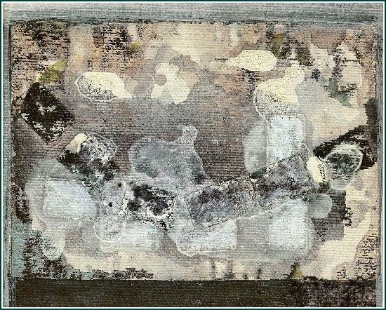
Sometimes, despite my best efforts, I can't make a composition work. Usually it will hang around for a long time, nagging at me to do something, until, to rid myself of the frustration, I'll gesso over the canvas and re-use it. Occasionally though, I like parts of the work enough to want to keep them, and I have had some success with cutting up the canvas and making several smaller paintings out of it. I've yet to try this with a representational painting--now that would be a challenge!--but I've done it several times with abstract work. 

The first time I tried it was with a painting in which I tried to incorporate "windows" into an abstract composition. I never took a photo of it, so I can't show it here. I still like the idea of creating the illusion of looking through the painting at images underneath, and will return to it sometime; but in the case I'm describing the "windows" were the only parts that worked, so I cut all seven of them out, matted and framed them, and called them "Little Paint Poems." I still have three of them, having sold two and given two away as gifts. They are about 3" x 4" in size.

In this case the parent painting never got finished. I tinkered away at it but gave up. The next time I took scissors to canvas was rather different: I felt the painting was finished, and I put a frame on it and hung it on my wall. But somehow I wasn't satisfied with it.


From the Floor
I called it "From the Floor" because it was a more or less accurate rendering of paint spatters on the studio floor. This was the assignment set on the first evening of a course on abstract painting at Langara College. It wasn't until later that I noticed that the shapes suggested sea creatures, an idea that influenced my selection of bits to cut out and keep, and the titles I gave them.

Marine Abstraction 2 - 14" x 10" - 2010
Marine Abstraction 1 - 14" x 10" - 2010


I found a pair of rich-looking gold-painted frames that set off my marine fantasies very nicely, and I sold them soon afterwards.

And so to this year, when I participated in a two-day workshop on intuitive painting with artist Eri Ishii. We were asked to use various non-traditional tools (not brushes) and just two or three colours to make marks on unstretched canvas. This is my rather messy effort:

 
Perhaps because of the sombre colours I chose, or else because of the dreary weather that day, I felt almost immediately that my painting represented a battlefield. These were melancholy images of war. They didn't form a composition, but they were powerful. So again I selected bits, and produced four small paintings. I wanted rough edges, so instead of using scissors I tore the canvas, and glued the pieces on to 8" square white panels.


The course of editing, however, did not run smooth. I bought two of the panels from a craft shop, to see if my idea would work. Pleased with the first two paintings, I went back to buy more panels--but of course, I'd had the last two, and they were now discontinued. I tried all the Lower Mainland branches of the store, but with no success. I did track down two more at an art supplies store, but they weren't an exact match, and were quite different on the back, which made framing tricky. Ah, framing . . . I had one suitable black frame, but needed three more. I was delighted to find them all on the same shelf--no chasing around the region this time--but when I'd solved the problem of how to get the frames on to the two different kinds of panel, and hung the four paintings on the wall to admire them, they didn't seem quite right together.  I stared at them in bewilderment, and then measured the frames. One of the new purchases was an exact match for the one I had, but the other two were slightly larger and deeper. I haven't yet had the heart to go shopping again.
Four Images of War - 2013

Friday, October 18, 2013

Call of the Abstract: Truth or Lies?

Galaxy - acrylic - 17'x17" -1999
Knowing that my painting activity this year was likely to be interrupted by trips to England to deal with family matters, I set myself a modest assignment: a series of small non-representational paintings on canvas boards. It had been a long time since I did any abstract painting--here's one example that I still like--and it felt like the right time to try it again. I had learned a lot from painting from photographs, but my last year's work--a series of artists painting or drawing ( Please see Meet the Artists, this blog, November 13, 2012) had taken me as far as I wanted to go in that direction. Apart from a pair of landscapes for a group show, all my painting time this year has been spent creating images that have no basis in reality and not even a mental picture as a starting point. Copying, whether from the real world or from photos, plays no part in this process. My initial intention with each new piece is simply to create . . . something. When it seems to be completed and I can sign and frame it, it is . . . what it is.


This all sounds nebulous and hard to defend. Yet I am certainly not breaking any new ground. Abstract painting is a hundred years old, and Jackson Pollock, perhaps the most famous--or notorious--of the American Abstract Expressionists, died in 1956! My modest little efforts are in the tradition of artists who sought to escape the limitations of realistic representation by creating something from scratch, with as little conscious forethought as possible. It sounds as if it ought to be easy, and occasionally it is; but my experience has been that, while nothing could be simpler than to produce a bad abstract work, creating a good one (and who's to say what that is, anyway?) is almost unbearably difficult. The problem is that there are no external reference points as there are with representational images. A building that won't stand up, water that flows uphill, clouds pasted on a sky . . . all look "wrong" in a landscape. And everyone has a mental picture of how people's faces and limbs should "go" --which is probably why Picasso's distortions continue to cause such bewilderment and derision. But in an abstract work there are no guidelines apart from one's intuitive sense of colour, composition, line, balance--the elements of painting.

Having decided that I needed to do the opposite of painting realistically, or even interpretively, from photos, I was looking for a way to get started when, as often happens, one fell into my lap. An artist called Anita Nairne came to a meeting of the Vancouver Sketch club to give a presentation on her approach to "Intuitive Painting." Anita had her audience members cover a surface with splotches and streaks of paint, working without thought or planning. Next we propped up each piece and studied it from a few feet away, turning the rectangle in all four directions and discussing what images we "saw" in the chaotic mess. The next step, after choosing the preferred orientation, is to pick out the images or shapes one wants to keep and develop, and outline them in chalk. These form the basis of the composition, which can then be completed however the artist wishes.

Anita is not an abstract artist, as you can see from the work on her website,  www.anitanairne.com . However, I saw right away that her method could be applied to abstract shapes, and I began to try it. I used the leftover paint on my palette to daub on my first canvas board, with the results shown.

View 1
View 2
 I settled on View 2 and began a back-and-forth process of over-painting and redrawing as I tried to wrestle the raw beginnings into a finished product. I constantly heard in my head the voice of Lucy Hogg, one of my first painting instructors, as she exhorted her students to "listen to the painting," but to be very careful, because, she would add with a wicked little smile, "It will tell you lies!"

Any artist will tell you that one of the most difficult decisions is when to stop working on a painting, and I've found that even more of a challenge with this way of working. There's the constant danger of pushing the composition too far and losing what one liked about it before. Nevertheless, I do reach a point where I feel comfortable about quitting. My first "Intuition" ended up like this:
Intuition 1 - acrylic - 11"x14" - 2013

 I decided not to give the paintings individual titles, even though I like naming things and some of the images are suggestive of living forms or of quasi-narratives. Just giving them numbers seems to liberate them from specific meaning and to give free rein to the imagination. Here are the next two, the same size as the first:
Intuition 2
Intuition 3 
Intuition 5
At this point I made a mistake and bought a packet of boards that I thought were the same size but were in fact ten inches high instead of eleven. I am at present working on Intuition 9. The process continues to be exasperating, time-consuming, and fascinating to the point of obsession. Each time I have absolutely no idea what the finished product will look like. Now I have them grouped together on the studio wall I am pleased with the effect. But I don't really know what to make of them. What do you think: are they telling me the truth, or lies?
                                                                                 
Intuition 4

Intuition 8
Intuition 6


Intuition 7 - acrylic - 10"x14" - 2013


Monday, February 11, 2013

Apologies to Munch: "The Groan"

Munch's Scream is one of our most familiar images, endlessly reproduced, parodied, reworked and commercialized, as well known as the Mona Lisa. For a few dozen examples, serious, humorous, witty, and vulgar, please go to https://www.google.ca/search?q=munch+scream&hl=en&tbo=u&tbm=isch&source=univ&sa=X&ei=gZkZUe_YK-iAiwKQuIDIAw&sqi=2&ved=0CDYQsAQ&biw=1920&bih=890  . Munch himself revisited the theme several times, expressing the emotional pain that he experienced in his personal life, and by extension, the angst of his times. Obviously I need to apologize to Munch for yet another reworking of his famous image; now I will explain, and try to justify, my doing so.


In the early part of 2012  I made a series of paintings on the theme "Quotes from the Masters."  The idea was to refer to famous works of art without copying them exactly, a requirement I fulfilled by reworking images first by Van Gogh and then by Tom Thomson but changing all the colours to their complementaries. I wrote about my "mutants" in this blog--please see my entries for March and November 2012. For me this was a new and challenging way to work, and to feel closer to the creators of the paintings on which I was focusing my attention.

Around this time, Ruth Payne, who runs the Ferry Building Gallery in West Vancouver, announced a themed exhibition to be mounted in 2013. The theme was "Hungry Ghosts: Living in the Age of Consumerism." The phrase "Hungry Ghosts" was evocative, but didn't mean much to me, and I dismissed the project from  my mind. A bit later, however, I heard Ruth explain that the hungry ghosts, deriving from Zen Buddhism, are mythical beings that are perpetually hungry but can never be satisfied. [Much later I was to learn that the ghosts are unable to swallow because their necks are too thin; if I'd had that information sooner my painting would have turned out rather differently . . . ] The germ of an idea lodged in my imagination, and became gradually more compelling. Could I perhaps "quote" from Munch and turn his screaming figure into a hungry ghost? I bought a book with a good reproduction of one version of The Scream  and decided to keep Munch's composition and colours much the same, while making my figure hugely obese and substantial instead of the original wispy waif. The painting evolved as I worked on it and reflected on the theme. My interpretation is a representation of an eating disorder, and by implication of addictions in general. Like the Zen ghosts, my overindulger is always hungry and never satisfied, regardless of how much she eats. The title that popped into my head one day as I was working refers to the bellyache that the person suffers from eating too much unsuitable food, and the psychic pain of addiction. Of course, it's also a play on Munch's title.

The Groan - acrylic - 24" x 20" - 2012
At first I kept the strong diagonal line of the fence rails or bridge parapet of Munch's painting, but as my figure increased in bulk she squeezed out the background. I had also wanted all along to include a reference to junk food. Timidly I introduced a cupcake or two . . . then more and more . . . until I had a whole incoming tide of cakes that threatened to surround the figure and overwhelm her. So the cakes come to represent the flood of unnecessary consumer stuff, edible and otherwise, that arouses our desires but fails to satisfy for long.

It will have become apparent that for me this had turned into a serious painting on a serious theme; but I have to acknowledge that it also belongs to the long line of jokes at the expense of The Scream. Some of the people who have looked at my painting have laughed--and then felt they had to apologize! A few said they found it disturbing. And a number responded by salivating over the cupcakes!

The Groan was accepted by the jury who adjudicated the submissions, and duly appeared in the "Hungry Ghosts" exhibition in January, along with an interesting and varied collection of two- and three-dimensional work. There is  a satisfaction in responding to a challenge like this one: as with the best art school assignments, they nudge me in directions that would never otherwise have occurred to me.


Tuesday, November 13, 2012

Meet the Artists--in person and on canvas!

In a few days' time, on the weekend of November 16 - 18, along with most of my studio mates, I will be taking part in this year's Eastside Culture Crawl. For me it will be the eighth time I have played hostess in my studio space, first at 901 Main St. and then, since 2010, at Portside Studios, 150 McLean Drive. For detailed information about the Crawl, and to download a map showing all the participating artists and studios, please see www.eastsideculturecrawl.com
If you have never "crawled" before, be warned: this is a very big event with an awful lot to see!The list of artists in the printed brochure takes up four double-columned pages. We are spread over an area extending from Main St. to Victoria Drive and from East 1st Ave. to the Burrard Inlet waterfront. So although there are dedicated Crawlers who make a full time job of it from 5 pm on the Friday through to 6:00 on the Sunday (maybe they are the same people who see ten movies a day during the Film Festival) most people select a few studios, giving preference to artists they know personally or whose work they admire. Another warning--mid-November is not the best time of year for leisurely strolls through Vancouver's streets! Although we have occasionally had beautiful autumn days, my memory tells me it's more  often been pouring, and once we had a blizzard. So a policy adopted by the initiated is to favour buildings like Portside Studios, where there are a number of artists to visit and where once you are inside you are good for at least half an hour and can dry off and warm up.

In my last blog post (October 9, 2012) I wrote about the opportunities that have presented themselves this year to hang paintings on other people's walls. In the case of the Crawl, of course, I'm using my own walls, the ones I rent at Portside. Most of the work I'll be showing is from this year and includes the paintings I've completed so far on the theme "Artists at Work." I referred to two of them last time, but there are eight more. What attracted me to this subject is the intense absorption and concentration of all the artists, amateurs and professionals, who range in age from about twelve months to more than seven decades. As I wrote in "Facing Facts"--please see this blog, September 11, 2011--I like to see children engaged with their whole bodies and all their senses in an activity which, for the time being, is the most important thing in the world. Years ago, as an education student, I read a book by Maria Montessori. I remember almost nothing about it except that Montessori called this concentration "the great work of children," which adults should respect, even revere. I enjoy watching my grandchildren absorbed in their "great work", but I don't believe they have a monopoly on it. Certainly artists at work demonstrate the same attitudes.

The artists I've painted are people of whom I had taken or acquired photographs that I found interesting. They include friends, acquaintances and family members, and one or two whom I met on  painting holidays. I will not give any of them a name, so it's fine if they don't recognize themselves!

Artist in a Field of Gold - acrylic - 2012 - 16" x 20"
First, two people painting outdoors in southwestern France. A group of us were there for a painting holiday arranged by the proprietors of Brambles, an art retreat in Devon, England. (For information about their courses and trips see www.bramblesartretreat.com .) We were in a beautiful rural setting not far from Toulouse and the foothills of the Pyrenees.On a sunny but coolish September morning we strung ourselves out along the side of the road to paint the view across the fields, which included a fine Romanesque church. 
 
Artist in a Bean Field - acrylic - 2012 - 16" x 20"
When artists are busy it is as if they were in their own little world, as if other people didn't exist. The chair backs and the backdrop of trees seem to define these little worlds and separate the artists from the viewer.

 
Bridge on the Lydd


The Red Tractor

The next artist was also a Brambles student, but this time at the retreat in Devon, in June. We had a week of glorious weather and were able to work outside every day. In this picture we were in the yard at Brambles, but we also worked in a farmyard, where I painted "The Red Tractor," and in a partly dried up river bed, which I wrote about in my post of September 13, 2011.
Artist on an Iron Bench - acrylic - 2012 - 16" x 20"


"Artist on an Iron Bench" is perhaps my favourite so far. I like the minimal background and the pinkish colour, which suggests the wall of the old cottage.

Next we go to Vancouver Island and a chilly spring morning. You have to be dedicated to sketch outdoors in anything but perfect weather, but this artist and I dressed warmly and stuck it out for a couple of hours.
Artist in a Forest - acrylic - 2012 - 16" x 20"

The next three artists are members of Vancouver Sketch Club, and as I mentioned last time, were my contribution to the Sketch Club's 60th anniversary exhibition. We were drawing from the model in the Coach House at Hycroft, the headquarters of the University Women's Club of Vancouver. In the case of "Artist in a Black and White Outfit", it was the coordinated outfit itself which appealed to me, whereas in "Artist in a Red Scarf" I particularly liked the network of easels in the background. "Artist in Shirt Sleeves" was a challenge since I changed the background several times, moving the open door, eliminating it completely, and finally reinstating it, since the composition seemed to need something there.
Artist in Shirt Sleeves - acrylic - 2012 - 16" x 20" 
Artist in a Black & White Outfit - acrylic - 2012 - 20" x 16"
Artist in a Red Scarf - acrylic - 2012 - 16" x 20"
                                                     
Shore Line
Artist beside a Pond - acrylic - 2012 - 16" x 20"
I wrote about summer sketching in"The Great Outdoors", August 7, 2012. One of our regular venues is Jericho Beach Park, where there is a variety of subject matter to choose from. Several years ago I spotted the row of elderly ladies that became the painting "Shore Line." This year I photographed the woman who features in "Artist beside a Pond." I particularly liked the way the trees and plants framed her, enhancing the "own little world" effect.

Artist in a Red Chair - acrylic - 2012 - 20" x 16"

Artist with a Green Crayon - acrylic - 2012 - 16" x 20"


Finally, the two youngest of my artists. On one of our summer sketching days a member brought along her grandchildren, whom she was baby-sitting for the day. I loved the way the little girl in "Artist in a Red Chair" had curled herself up as she drew the trees edging the park. Maria Montessori would have been happy to see her, as she would with the baby boy in "Artist with a Green Crayon." Scarcely big enough to see over the table, and with his left thumb an essential part of the creative process, this tiny artist is just as absorbed in his Great Work as any of the other people in my series.

Do come and see the paintings if you are in the Vancouver area, and contact me if you have a photo of your own Artist at Work that you might like to see as a 16" x 20" painting. One condition--no mugging for the camera--your artist must be oblivious to everything except the task in hand! you can send me a message via this sight, or through my website, www.myartclub.com/judith.fairwood


Next blog post? Probably not before January.